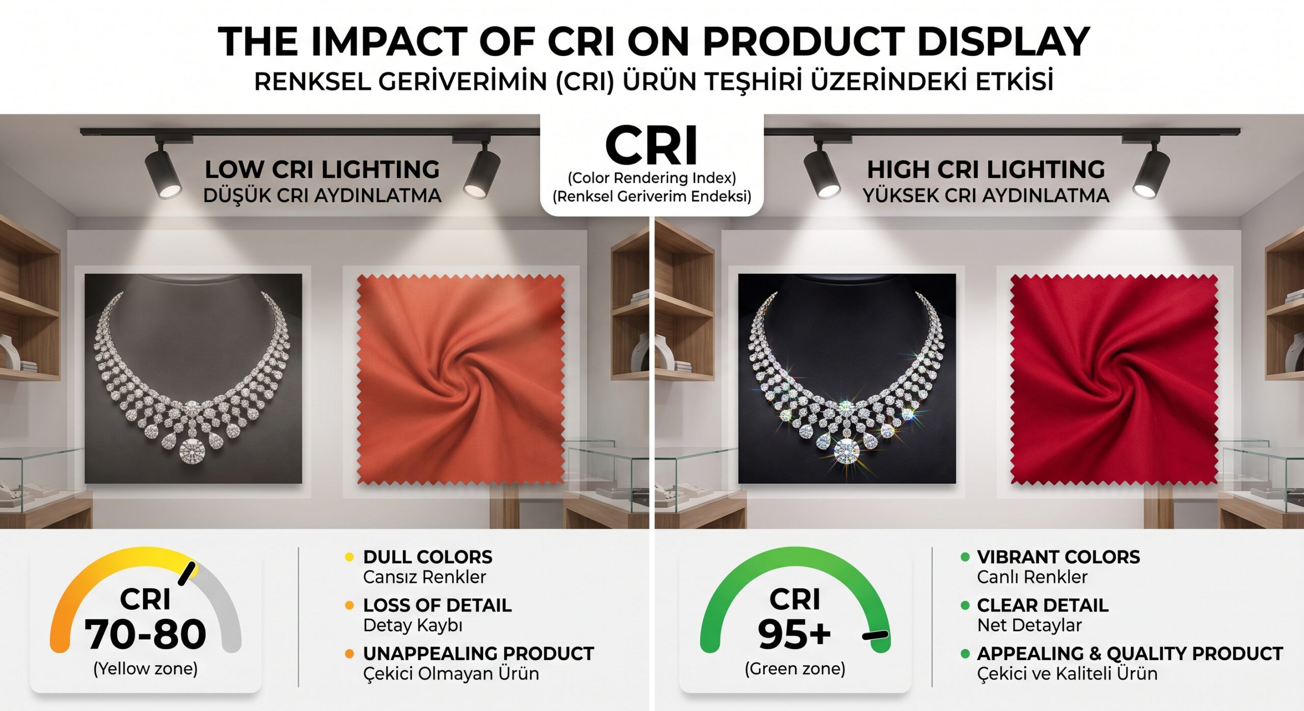
Color Rendering Index (CRI) and why it makes your products look better is the most critical lighting metric in retail: it directly shapes the customer experience, lifts sales rates and strengthens brand image. This value shows how accurately a light source reproduces the true, natural colors of objects compared with sunlight. It determines the appeal of your products on the shelf and influences the shopper's buying decision in the very first second.
Drawing on more than twenty years of field experience, I can say with confidence that lighting is not merely a tool that frees spaces from darkness; it is an invisible marketing expert that conveys the soul and quality of a product to the consumer. A store without a well-planned lighting strategy and equipped with weak light sources cannot get its quality across to the customer's eye, even if it sells the finest and most expensive products in the world. When customers walk into a store, they notice colors first, then textures, and details last. Seeing colors accurately triggers a direct sense of trust and quality in the human brain. So even if you spend millions on your store design, the impact of that entire investment will be greatly diminished if your light sources cannot reflect the true colors of your products.
In today's fiercely competitive commercial environment in particular, consumers' attention spans have become very short. The golden few seconds you have to draw a passerby in from the window, or to convince a customer inside to buy, come down entirely to how the product looks. This is exactly where the technical foundation of your luminaires and the quality of the light they deliver come into play. In this article, I will examine this magic metric at the heart of retail lighting in full detail and explain, step by step, how it can change the fate of your store.
What Is the Color Rendering Index (CRI) in Lighting Technology and How Does It Work?
The Color Rendering Index, known in the international lighting literature as CRI, is a quantitative measure of how faithfully and accurately an artificial light source renders the colors of the objects it illuminates compared with an ideal light source, that is, natural daylight taken as the reference. Also known as the Ra value in scientific texts, this metric is evaluated on a scale from 0 to 100. A value of 100 represents perfect color accuracy and the flawless, continuous spectrum offered by sunlight. As the CRI value drops, the colors of objects begin to look faded, lifeless, grayish, or like entirely different colors.
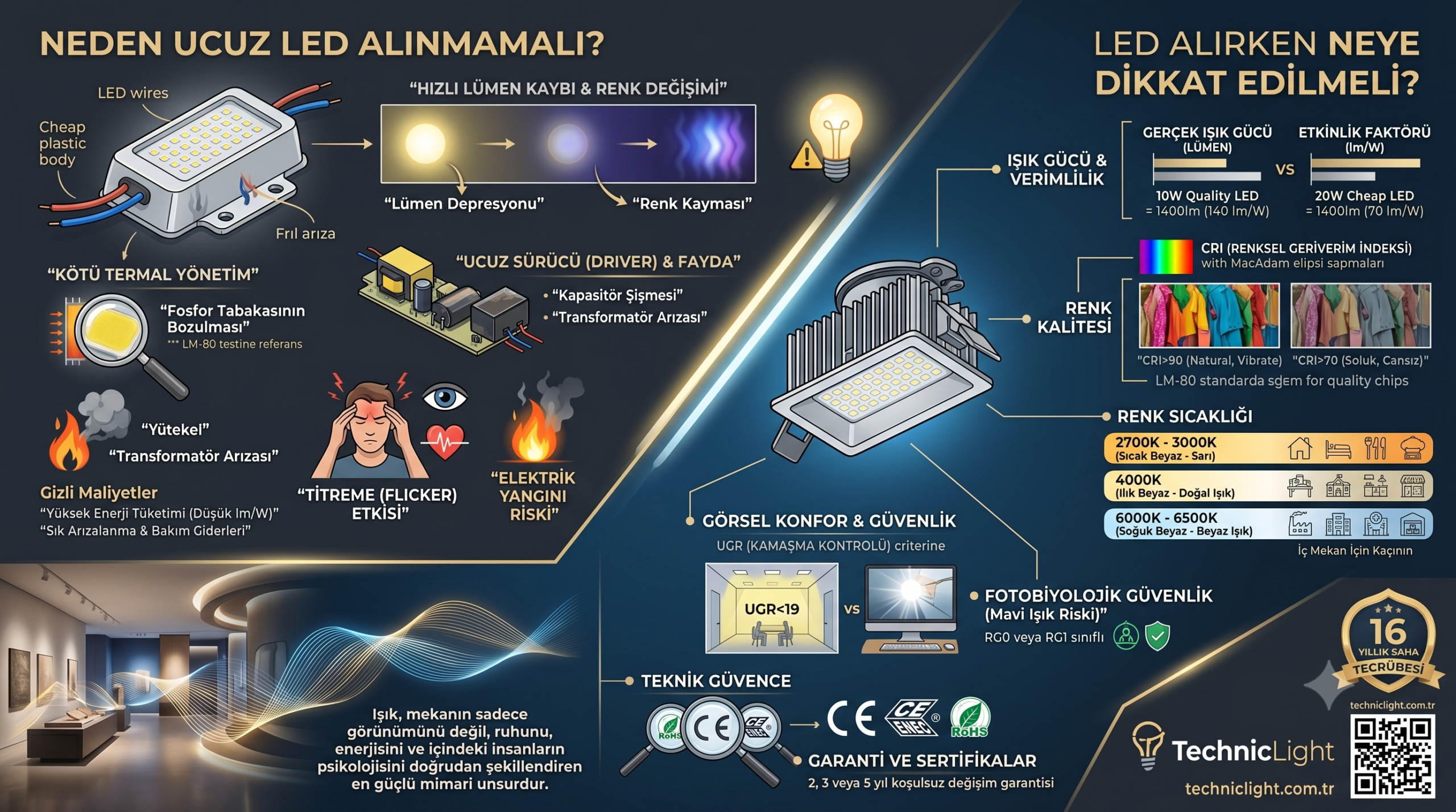
That said, as LED lighting technology has spread, concepts such as energy savings and lumens have taken center stage, while this vital metric that determines light quality has often been pushed to the background. A very bright LED luminaire does not necessarily emit good-quality light. Light is, in fact, an electromagnetic wave containing all the colors of the rainbow. If certain color wavelengths are missing from the spectral distribution of an artificial light source, a product under that light cannot reflect the missing color. Although the human eye has a remarkable ability to adapt, under light with an incomplete spectrum our brain constantly tries to correct colors. Over the long term, this causes visual fatigue, difficulty concentrating, and a desire among customers to leave the space as soon as possible.
Moreover, in the traditional measurement system, CRI is calculated by averaging only eight standard pastel reference colors (R1 through R8). This calculation method was regarded as the industry standard for many years. In today's modern lighting technologies, however, problems can still occur with saturated and vivid colors even when the average of these eight colors is high. For this reason, treating the subject not as a mere percentage score but as the quality of a broad light spectrum is a fundamental rule of successful commercial lighting.
Consumer Psychology and the Effect of Accurate Color Display on Sales
Consider a scenario that is common in the retail world and one of store managers' biggest nightmares. A customer walks into your store, loves that wonderful burgundy dress on the hanger, and buys it. But when they step outside into daylight, or under the lighting at home, they realize the dress is actually a dull shade of brown. This is a result of incorrect lighting in the store and is one of the main causes of product returns in retail. The customer is disappointed and their trust in your brand is damaged.
Extensive research on marketing psychology clearly shows that color is the strongest factor influencing the consumer's purchasing decision, by a huge margin of around eighty-five percent. Lighting systems with a high CRI value directly increase your brand's credibility and the perceived value of your products. The texture, material quality and fine craftsmanship of your products come fully to life only with accurate color rendering. When your customers see your products exactly as they are, in their most attractive, truest and most natural form, the value they attach to the product rises and their resistance to buying is broken down.
In addition, the time customers spend in well-lit stores where colors are displayed vividly increases noticeably. Customers find the space airy and the products inviting. A consumer who is mentally relaxed and visually satisfied always has a higher average basket. For this reason, seeing lighting investment not as an expense but as a marketing tool that directly supports sales is a shared trait of visionary businesses.
Strategic Benefits of High CRI Across Different Sectors
The effect of light on products varies with the nature of the displayed product and the dynamics of the sector. Every sector has its own color codes and the details it wants to highlight. Let's now take a closer look, sector by sector, at how color rendering strategies that make your products look better should be applied in different commercial areas.
Highlighting Fabric Textures in Textile, Apparel and Fashion
In textile and fashion stores, light is the store's most talented and silent sales associate. The softness of a cotton T-shirt, the elegance of a silk shawl or the warm texture of a wool sweater can only be conveyed to the customer through LED spotlights with a high color rendering index. In this sector, where color harmony is critical, a customer putting together trouser and jacket combinations must be able to tell color tones apart accurately. Fitting rooms in particular are the last and most important point where the customer makes the buying decision. Using low-CRI lights in these areas makes skin tone look pale, sickly and lifeless. Proper high-CRI lighting, on the other hand, makes the customer feel energetic, healthy and great in the garment they are trying on, creating a positive mood that leads directly to a sale.
Boosting Appeal in Fresh Food, Supermarket and Produce Sections
Food retail is perhaps the area where light quality is tested most mercilessly. For meat to look fresh, healthy and appetizing at a butcher's counter, red tones must be reproduced flawlessly. If standard or low-CRI lighting is used at the meat counter, the color of the meat turns brownish or gray and creates the impression that it is stale. Similarly, in the produce section, the vivid green of leafy vegetables, the bright red of tomatoes or the appetizing orange of oranges can be emphasized only with special food lighting that has a broad spectrum and high color rendering. Consumers always buy what looks fresh, and a fresh appearance depends directly on the quality of the light.
The True Brilliance of Stones in Jewelry
The products sold in the jewelry sector are, by nature, extremely luxurious, valuable and showy. The warm, rich glow of gold, the cool nobility of silver or platinum, and especially the unique play of color inside a diamond can be completely lost under ordinary lighting. In jewelry lighting, high CRI alone is not enough; the beam angle of the light and the spectral richness that clearly brings out the different color refractions inside a diamond are vitally important. High CRI lays out before the customer's eyes the billion-year formation story of that tiny precious stone and the fine craftsmanship of its maker, maximizing the value of the product.
Flawless Skin-Tone Matching in Cosmetics and Beauty Products
Cosmetics stores are places where even millimeter-level color errors are not forgiven. A customer choosing a foundation, lipstick or blush wants to see how the product blends with their own skin tone. A foundation that looks perfect under low-quality lighting can look like a mask on the face outdoors. In this sector, using special lighting systems that render skin tones accurately is essential. Perceiving colors exactly as they appear in the real world is the foundation of customer satisfaction and brand loyalty in cosmetics shopping.
Critical Differences Between Color Temperature (Kelvin) and Color Rendering (CRI)
One of the biggest points of confusion I come across in site inspections and project meetings is mixing up CRI and Kelvin values. Although these two concepts are both pillars of lighting quality, they describe entirely different properties. Kelvin indicates the character of the light, that is, how warm or how cool it is. For example, 2700 Kelvin offers a warm, welcoming atmosphere with a sunset-like yellow, while 6500 Kelvin offers the bluish, energetic whiteness of an overcast day. CRI, on the other hand, is a completely different parameter that measures how accurately the colors of objects under that light appear, regardless of the color of the light.
To understand this more clearly, let's consider a simple but effective example. Suppose you have two different LED luminaires at 3000 Kelvin, meaning they both emit warm white light. Both give the space the same yellowish, warm atmosphere. But let's say the first luminaire has a CRI of 70 and the second a CRI of 95. Under the CRI 70 luminaire, a red strawberry turns brick-colored and a tomato turns a pale orange. Under the CRI 95 luminaire, by contrast, the same strawberry looks blood red, extremely vivid, juicy and natural. In short, choosing the color temperature that suits your store's concept is only the beginning of the story; you must back that choice with a high CRI value.
Why the R9 (Red) Value Matters as Much as the Overall CRI Value
When CRI is measured under industry standards, the color accuracy of eight pastel reference colors, R1 through R8, is averaged. This standard measurement system, however, does not take vivid, saturated colors such as red, yellow, green and blue into account. This is the biggest quality trap waiting for uninformed buyers in the lighting industry. When you buy a standard LED luminaire on the market, you may see CRI 80 or CRI 90 on the product label. Yet the R9 value of that luminaire, which represents saturated red, may be in the teens or even, at times, negative.
Why is the R9 value so critical in lighting? Because red is one of the cornerstones of our natural world and of human physiology. A natural and healthy-looking skin tone, the warm tones in wooden furniture, the vibrancy of warm colors in textiles and the fresh look of food products all depend directly on a high R9 value. In a color rendering strategy that will make your products look better, you should ask your supplier not just for a general figure but for detailed test reports that include R9 values. Quality LED manufacturers use special technological blends to strengthen the red wavelength in the spectrum, and this difference can double the appeal of the product in your window within seconds.
The TM-30 Standard in Modern Lighting and the Quality Criteria of the Future
Lighting engineering and technology is a dynamic ecosystem that is constantly evolving. As the scientific community has come to understand where traditional standard CRI measurement falls short, far more comprehensive and modern color evaluation metrics such as IES TM-30 have begun to enter our lives. The TM-30 standard analyzes ninety-nine different real-world reference colors rather than just eight. In addition to the Rf value, which shows how faithfully the light reproduces colors, this system also offers the Rg value, which expresses how vivid and saturated it makes colors look.
Global retail brands and high-end design offices in particular now require not only traditional metrics but also these new standards in the projects for their new concept stores. In the future, it is clear that visionary brands will demand this detailed reporting to make their products stand out. By today's standards, however, the first and most practical step is to make sure the luminaires you use are built with high-quality chips and offer a broad spectrum. Keeping pace with advancing technology will always keep the visual quality of your store one step ahead of your competitors.
What to Consider When Making the Right LED Lighting Investment for Your Business
When setting up the lighting infrastructure of a store or commercial space, evaluating the process only in terms of energy efficiency and brightness per watt is a strategic mistake that leads to far greater costs in the long run. Here are the basic rules to apply, step by step, when choosing the right light source for your business:
First, analyze in detail the nature and color range of the product group you will illuminate. Decide whether you mostly sell cool-toned or warm-toned products.
Set the overall character of the space by choosing the Kelvin value that best suits your product group.
Insist that the luminaires you choose meet high color rendering standards, and aim for the highest levels especially for luxury retail.
Review the spectral test reports of products from lighting suppliers and check how well they perform in saturation of reds, blues and greens.
Instead of using light merely for general illumination, create accent lighting by directing it onto the products you display with the right optical lenses and angles.
When you follow these steps fully, your lighting system will stop being merely an installation that lights up the space and become the strongest, most effective visual presentation tool of your brand.
Return on Investment (ROI) and Long-Term Gains of High-Quality Lighting
Business owners often worry that the initial investment cost of high-quality, custom-made LED luminaires is higher than that of standard products. At this point, however, it is necessary to read the situation from the big picture. The added value of a quality lighting infrastructure has the potential to pay back the investment within months, even weeks.
Customers spend more time, and enjoy it more, in a properly lit store without tiring their eyes. Because they clearly perceive the details of products, the texture of fabrics and the vibrancy of colors, their purchasing decisions are faster. Moreover, because products will look the same color at home or in daylight as they did in the store, post-sale return rates drop dramatically. Flicker-free, high-quality light that reduces eye strain also helps your store staff work with more energy, focus and motivation throughout the day. When all these factors come together, the extra investment you make in lighting comes back to you multiplied, as increased revenue and brand prestige.
As someone who has devoted years to the magical, transformative world of light that gives spaces their soul, I can say in all sincerity that if you value your products, your effort and the brand you have built, never hesitate to give them the flawless stage they deserve. On your next visit to your store, look long and hard, with a buyer's eye and fresh awareness, at the spotlights on your ceiling and then at the products standing under that light. Perhaps the true potential of your brand and products has been waiting for years under those dull, inadequate, lifeless lights to be discovered and to dazzle your customers. I wish you bright, vivid and highly profitable sales as you discover the true power of colors.